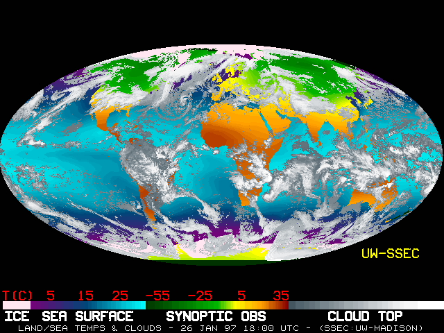
What's the temperature outside? No matter where you are on Earth, the above map can tell you. This global montage was created using the temperature data from numerous satellites orbiting the Earth. This map indicates temperatures recorded early on January 26th, 1997, but an even more recent map -- updated every 6 hours -- is usually available. For ocean colors on the map, lighter shades of blue indicate warmer temperatures, while for the land, red hues indicate relative warmth. Just looking at the map one can see that summer warms Earth's southern hemisphere, while winter chills Earth's northern hemisphere. The key at the bottom lists temperatures in degrees Centigrade that can be easily converted to degrees Fahrenheit.
¿Cuál es la temperatura exterior? Sin importar dónde se encuentre en la Tierra, el mapa anterior puede indicárselo. Este montaje global fue creado utilizando datos de temperatura provenientes de numerosos satélites en órbita alrededor de la Tierra. Este mapa muestra las temperaturas registradas a principios del 26 de enero de 1997, aunque un mapa aún más reciente —actualizado cada 6 horas— suele estar disponible. En cuanto a los colores oceánicos del mapa, los tonos más claros de azul indican temperaturas más cálidas, mientras que en el caso de las masas continentales, los tonos rojizos indican calor relativo. Con solo observar el mapa, es posible apreciar que el verano calienta el hemisferio sur de la Tierra, mientras que el invierno enfría el hemisferio norte. La escala en la parte inferior lista las temperaturas en grados Centígrados, las cuales pueden convertirse fácilmente a grados Fahrenheit.
